
Subtotal: $ 5,24
Original price was: $ 22,45.$ 11,78Current price is: $ 11,78.

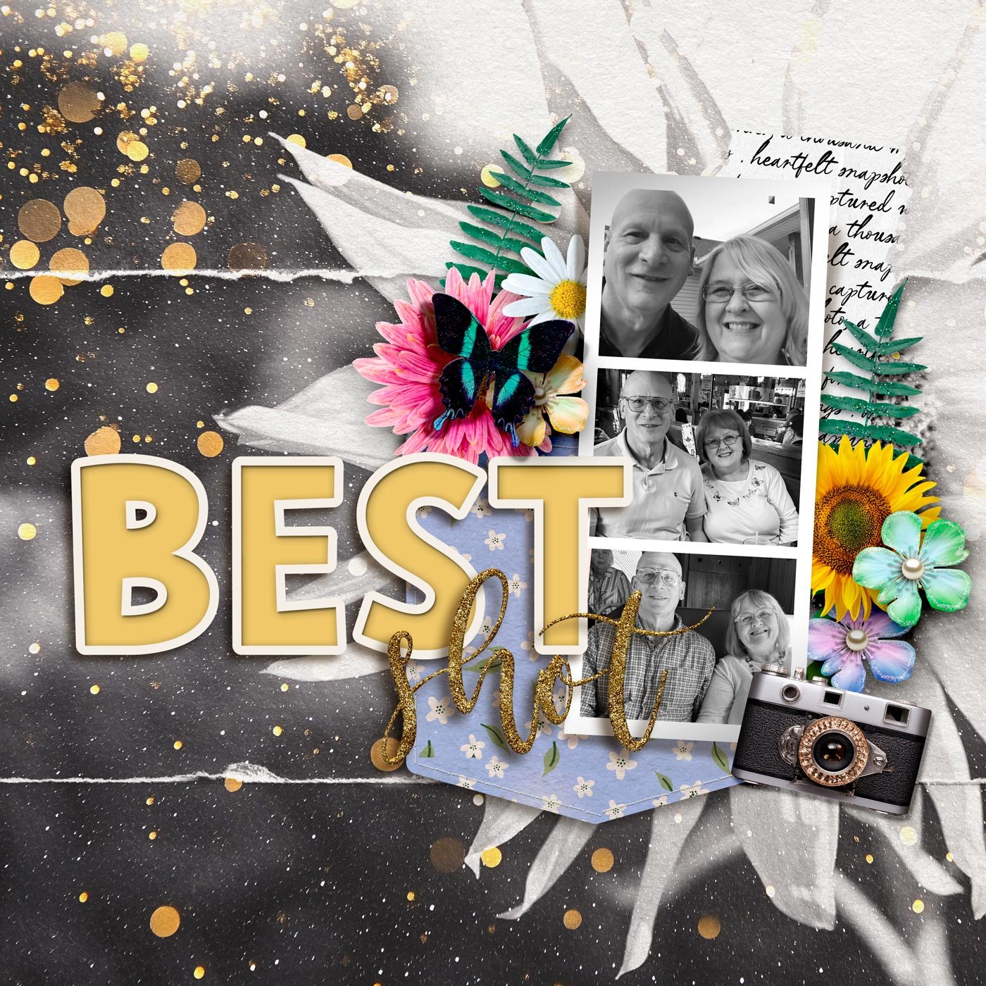
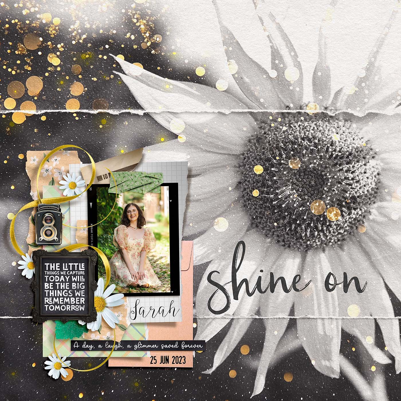
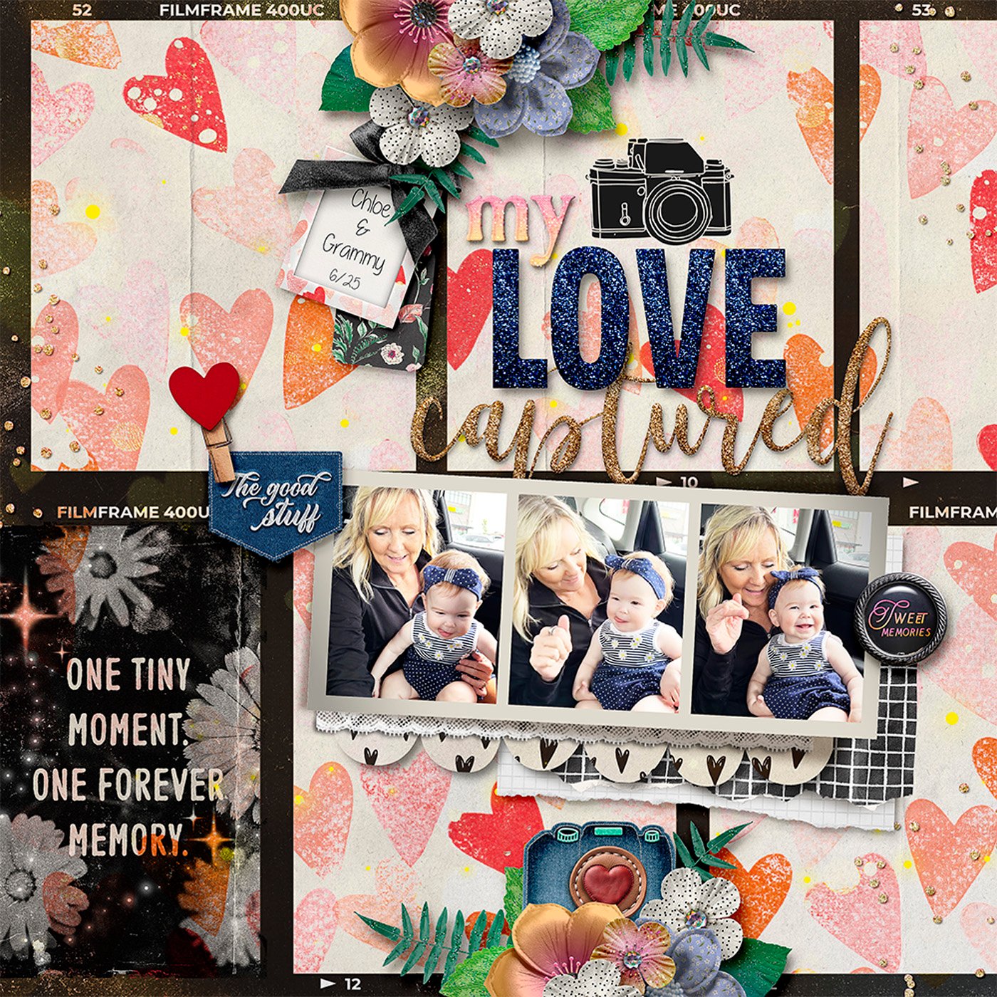
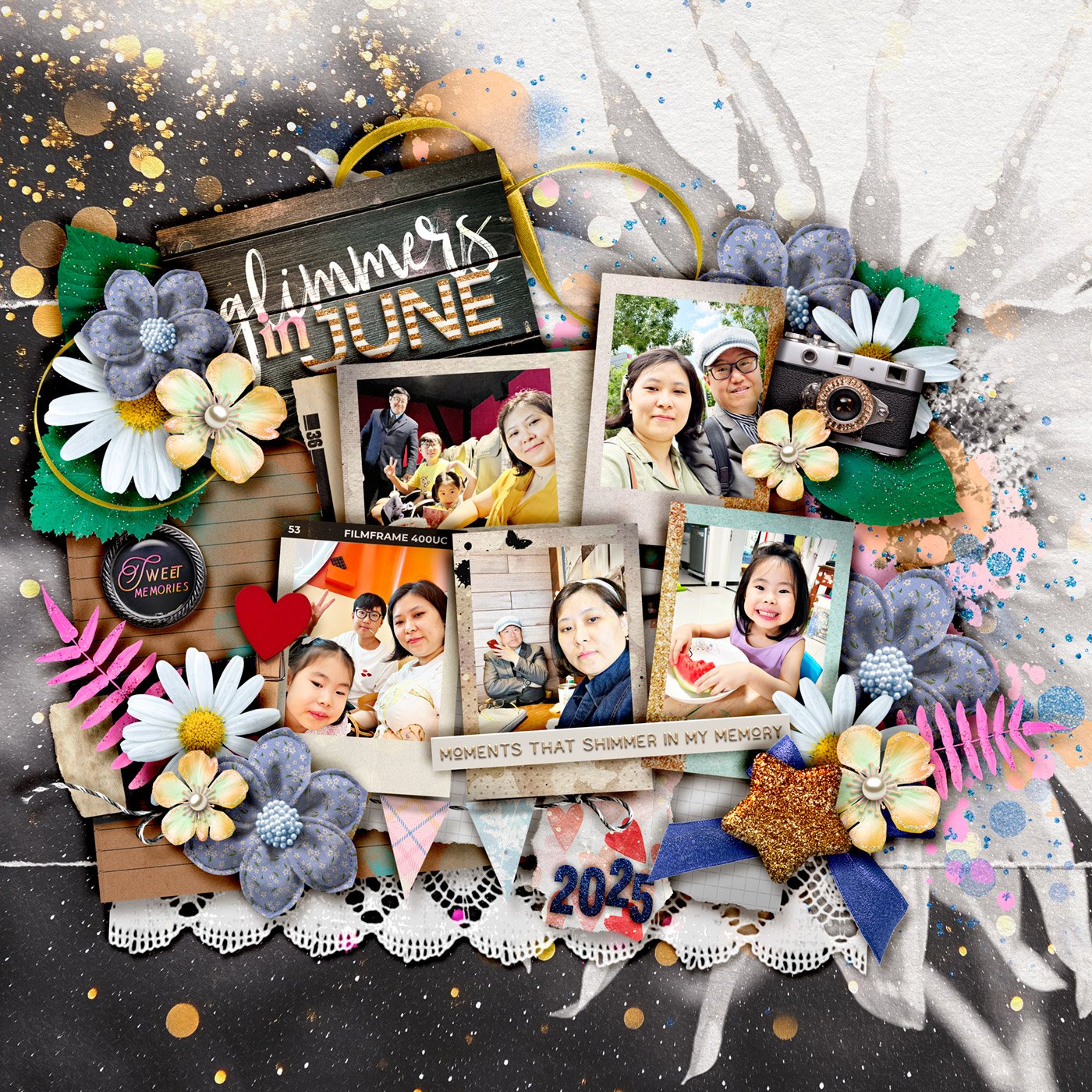
Colors do more than just make your scrapbook pages look pretty. They set the mood, create balance, and even evoke emotions. Understanding a bit about color psychology can help you design layouts that not only tell a story but feel like one too.
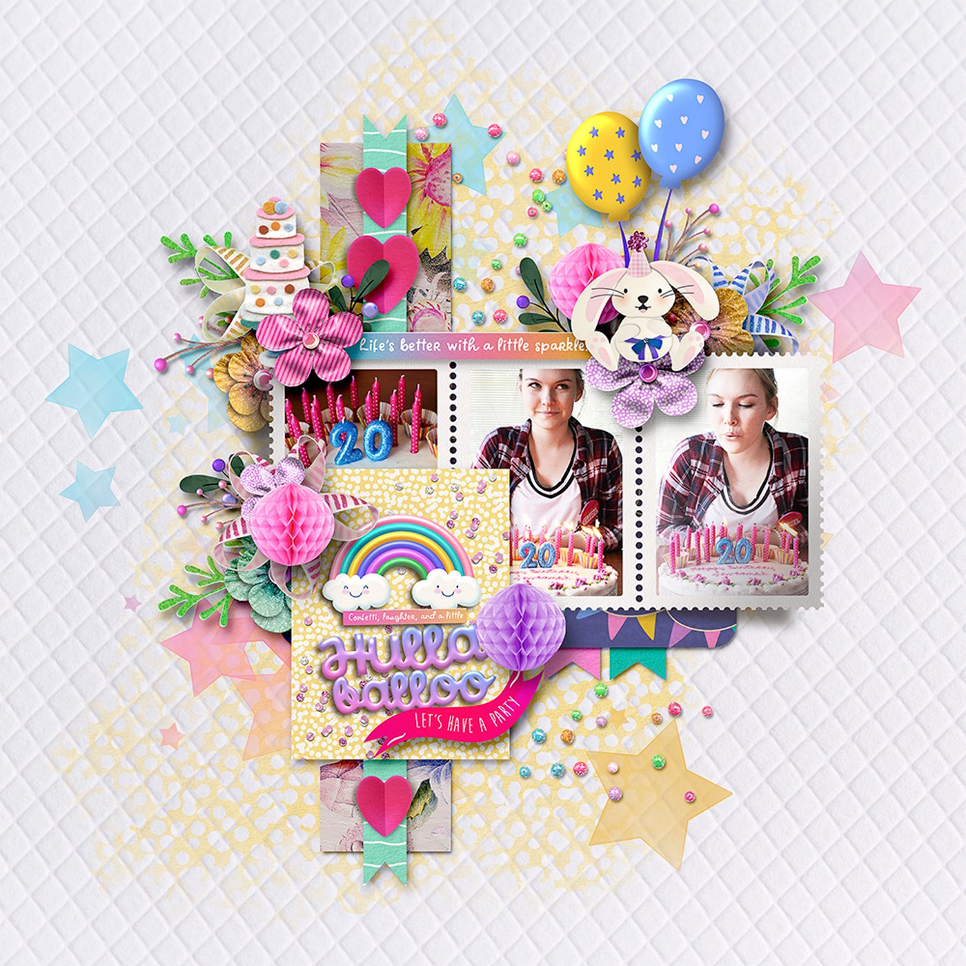
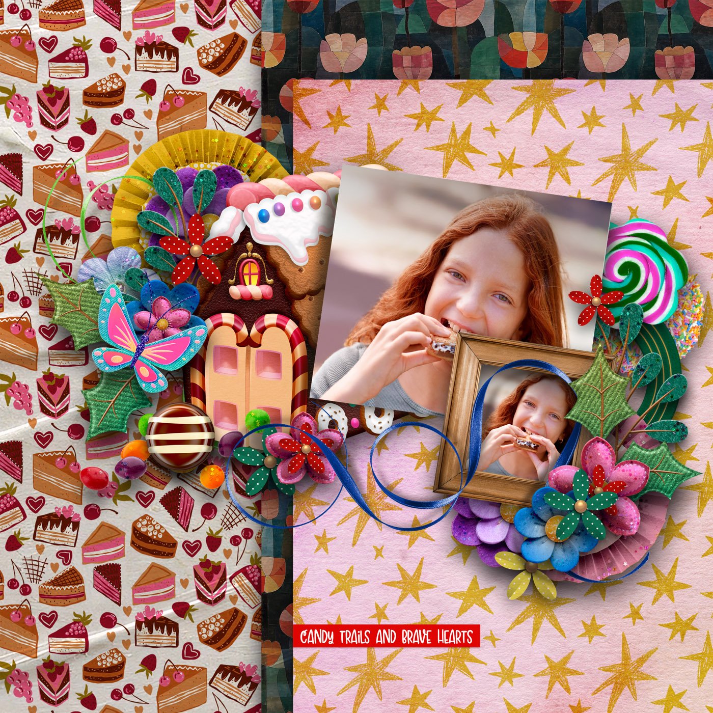
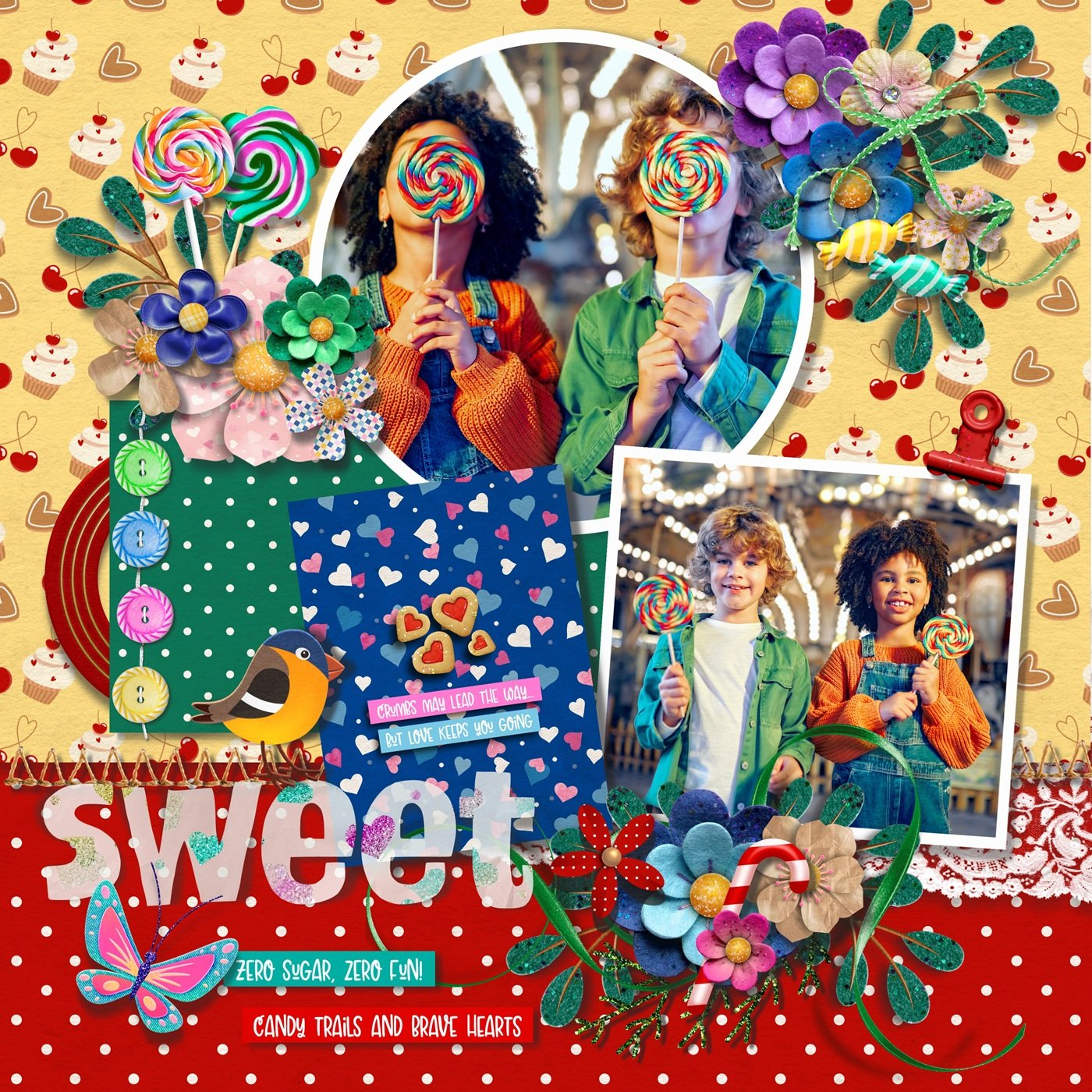
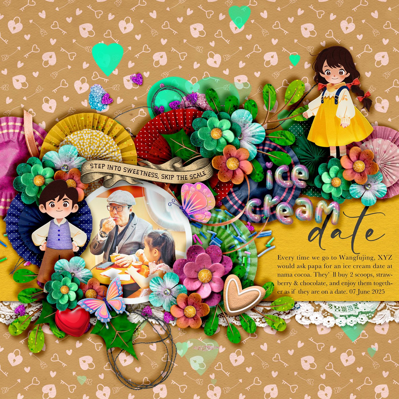
Red represents passion, energy, and love. It’s bold and attention-grabbing, perfect for lively, emotional moments.

Orange brings warmth, excitement, and friendliness. It creates a playful, adventurous vibe.

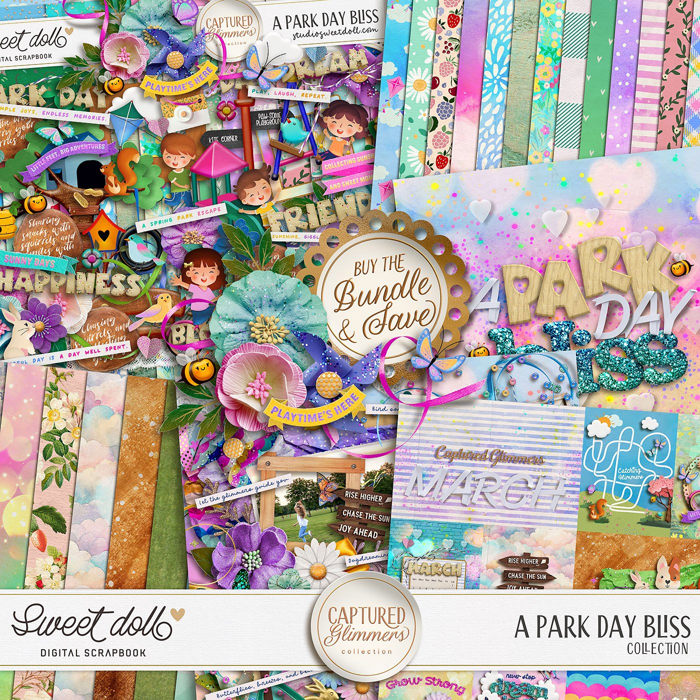
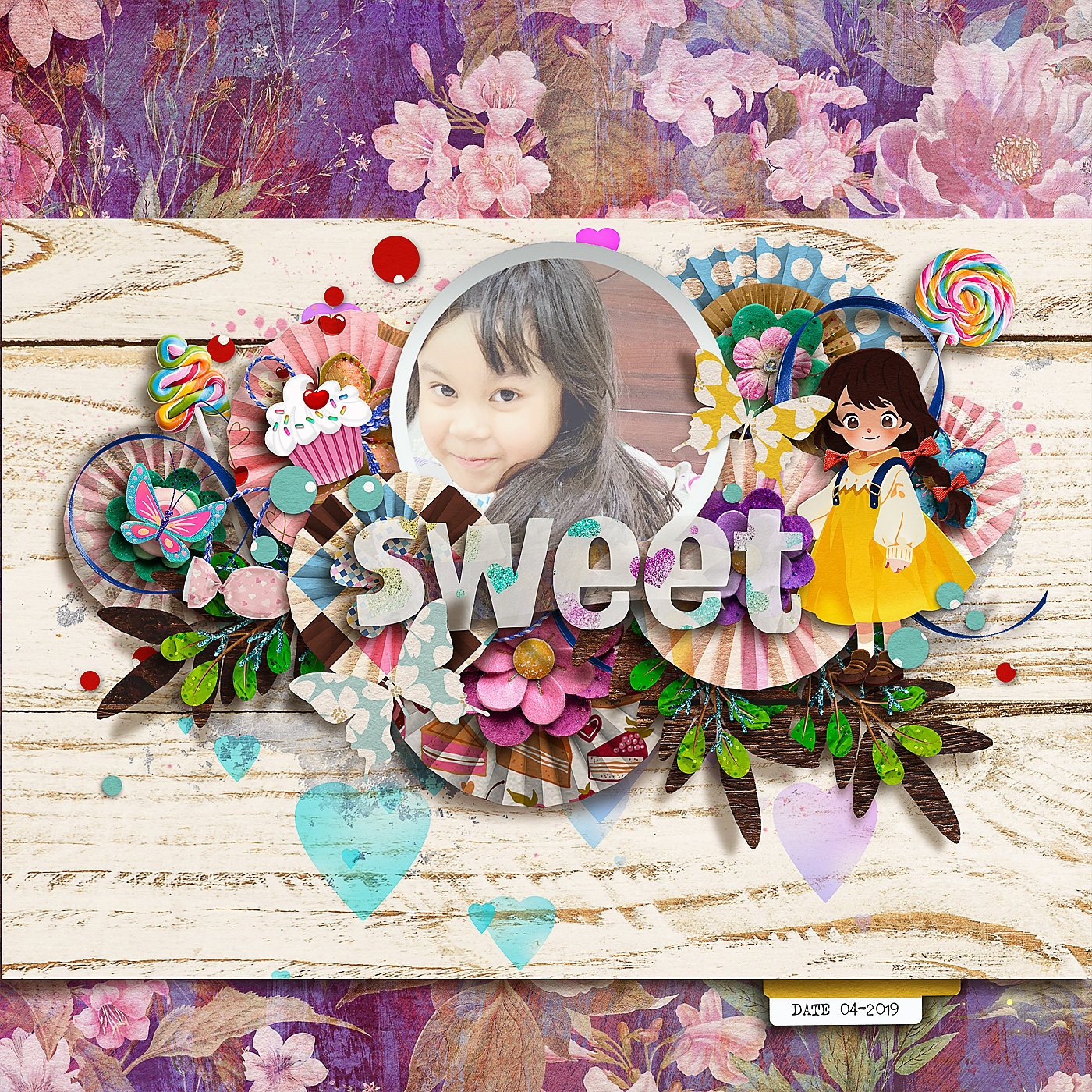
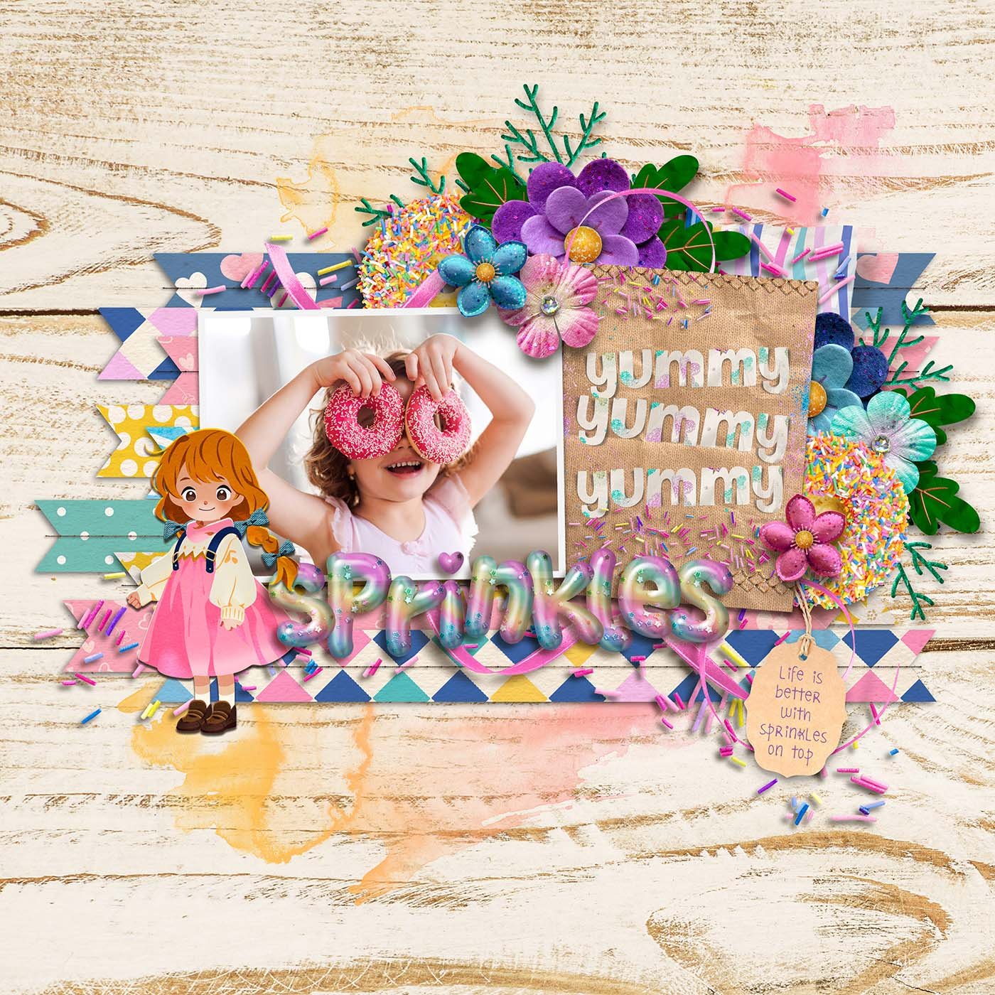
Yellow symbolizes happiness, optimism, and creativity. It’s ideal for capturing sunny days and joyful memories.

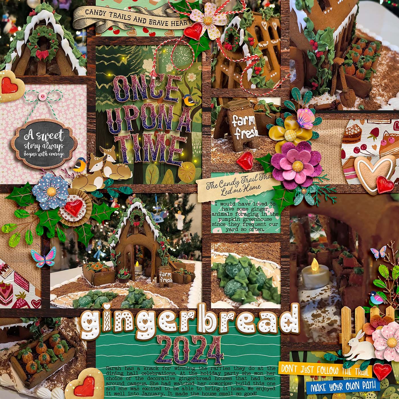
Green reflects balance, nature, and growth. It works beautifully for outdoor scenes or peaceful moments.

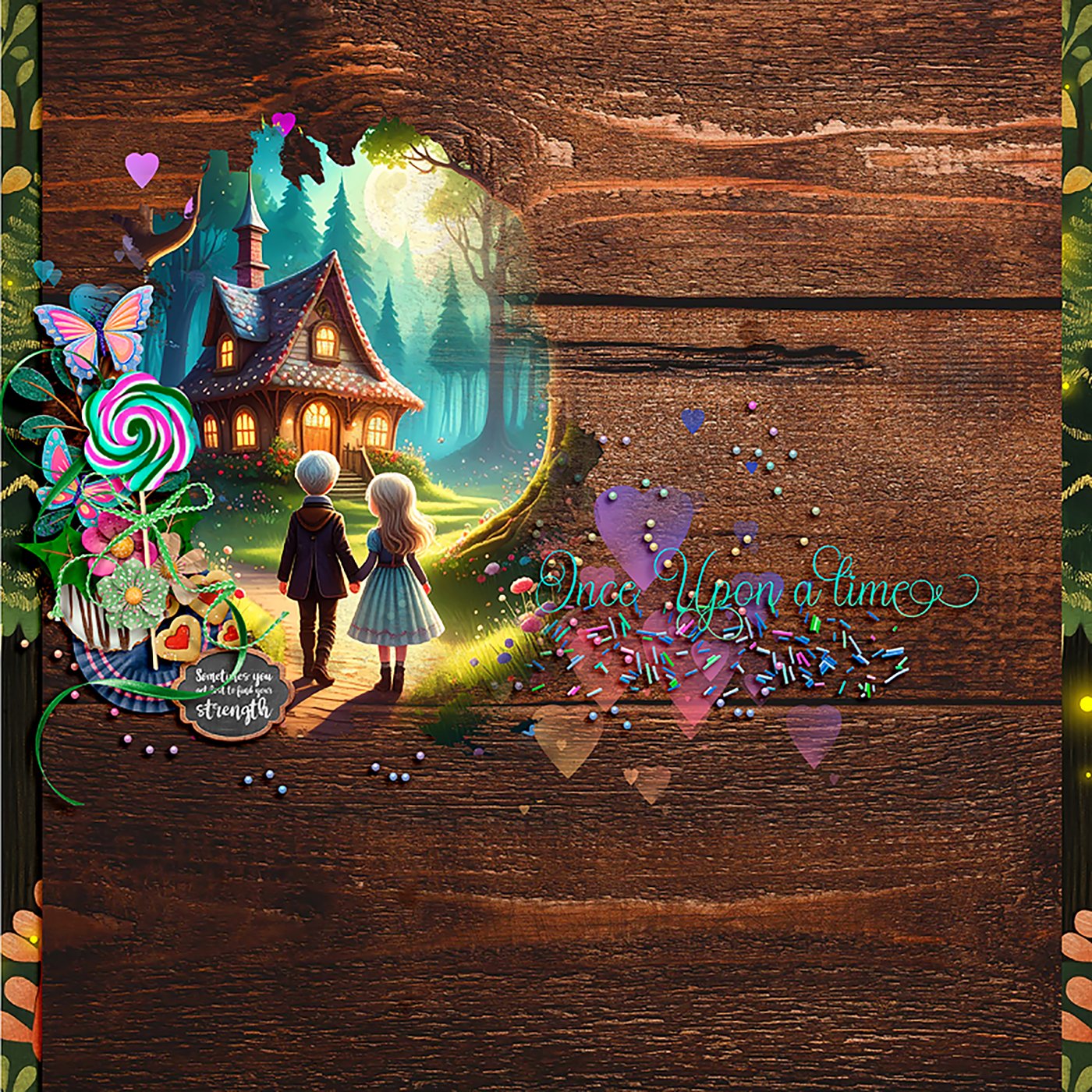
Blue evokes calm, trust, and serenity. It’s great for reflective, relaxing, or sentimental pages.

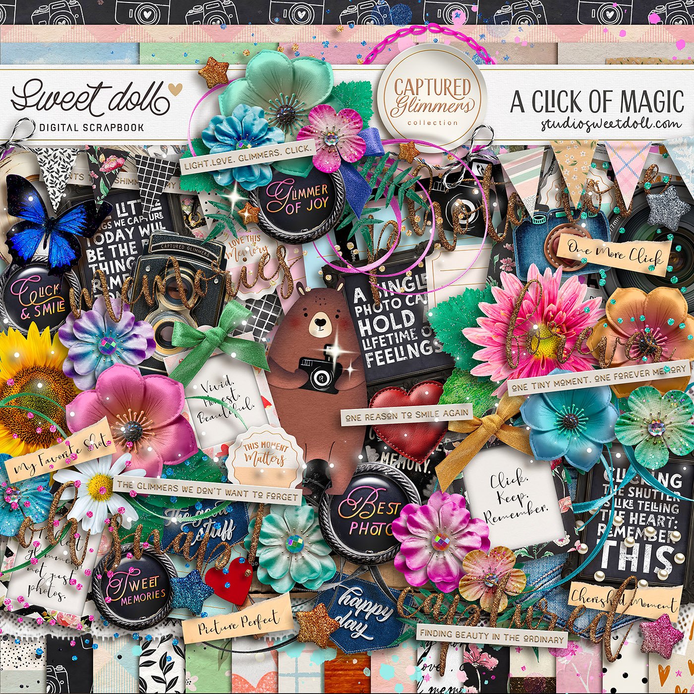
Purple represents creativity, luxury, and mystery. It adds a whimsical or even regal touch to your layout.

Pink conveys softness, love, and nurturing. It’s perfect for sweet, tender memories.

Brown brings stability, comfort, and warmth. It creates a cozy, homey, or rustic feel.

Black represents sophistication, drama, and elegance. It provides bold contrast and a modern look.

White symbolizes purity, simplicity, and lightness. It keeps things clean and airy, allowing your photos to shine.
Gray reflects neutrality, balance, and calm. It’s a great choice for backgrounds or to soften bolder colors.

By choosing colors that match the mood of your photos, you enhance the emotional impact of your page. A bright, bold palette can capture the fun of a summer day, while soft, muted tones bring warmth and coziness to a family gathering layout.
Next time you start a new scrapbook project, think about how you want the page to feel, not just how you want it to look. Color has the power to transform a memory into an unforgettable experience for you and anyone who flips through your album.
What color palettes are your favorites to work with? Do you find yourself leaning toward bold and vibrant or soft and soothing tones?
hugs, Raquel

Author

Follow for daily sprinkles of scrap-happiness!
for Your Memories.
© 2023-2025 ❤ Sweet Doll designs. All rights reserved.
sales & sweet stories.